Atlanta Web Design Blog

How the real web design experts optimize images
Displaying an image on a website isn’t as easy as it seems. There’s a lot more to it than a simple <img src””> tag. Properly sizing and optimizing is crucial to fast download speeds, good user interface and search engine optimization. Lead front-end developer John Graham recently led a Wednesday Workshop on the finer points of image optimization. Here are his notes from that session.
Questions to ask yourself when working with images
These apply when adding content images or authoring a reusable component (block) that uses images.
- What is the maximum size this image will be viewed?
- Is this image responsive?
- Is the image file properly prepared?
- Is this image being served with modern formats (webp)
- Does the image have an explicit size defined in code?
- Does this image need to be lazy loaded?
- Does this image need to be preloaded?
What is the maximum size this image will be viewed?
Full width desktop images should be sized at 1900px or 2500px.
Note: Wider desktops may scale these images up, so a wider image wider breakpoints may be necessary
We should never see images that are 8000px wide loaded into the browser.

Full width responsive images should be sized at the maximum width of the breakpoint.
Example: If the breakpoint is 1024px the image should be no more than 1024px
Note: If the mobile breakpoint is 768px the mobile version of the image should never be more than 768px
Content images should be sized as closely as possible to the size they will be viewed at any given breakpoint.

Use WordPress’s image sizes to auto generate sizes for you. Create your own as needed.

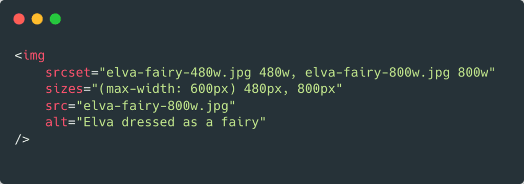
Is the image responsive?
Make sure your images are served responsively
Inline images should use srcset and sizes on the image tag:
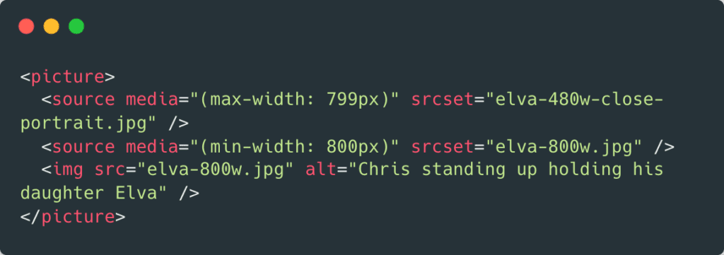
If you need to explicitly use a different image at mobile breakpoints, use the element with.
An example of needing this is for hero images that need a different mobile image for text legibility.
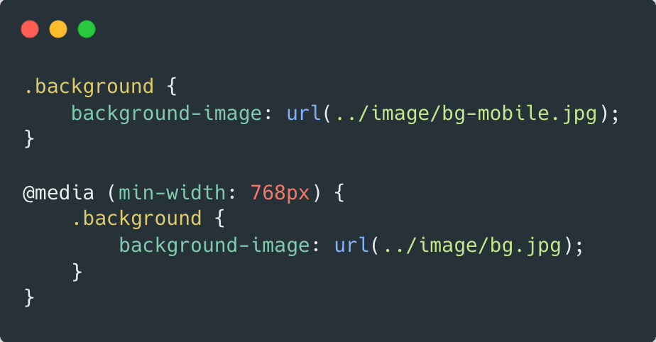
Background images should be handled with @media queries.
Note: One day we can use container queries
Use WordPress built in image functions to output tags. They are responsive by default.
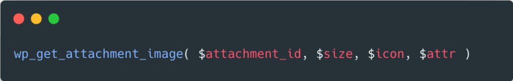
Note: Make sure when you output images from WordPress manually, you use the $size argument to grab the appropriate size.
Is the image file properly prepared?
- Make sure your images are appropriately sized.
- Use the correct format (png vs. jpg)
- Does your image really need a transparent background.
- For jpgs use save for web with appropriate quality settings.
Does the image have an explicit size defined in code?
Images should be given an explicit size so that the page layout calculated and Large Content Shifts are avoided.
When the dimensions are know, use width and height html attributes.
Secondarily, use css to size the images. Constrain images with max-width: 100% ;
Avoid aspect ratio issues by using css properties aspect-ratio and object-fit
Does this image need to be lazy loaded?
Images further down the page should be lazy loaded if possible.
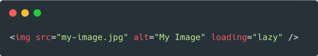
Images at the very top of the page, such as hero images, should not be lazy loaded to avoid Large Content Shifts.
Does this image need to be preloaded?
Images at the very top of the page, such as hero images, can be preloaded to tell the browser to prioritize
these downloads.
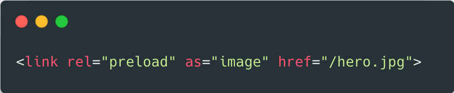
Note: For images in a hero slider, only the first image should be preloaded.
The preload tag can also load images responsively

ACF Fields can be used to specify which images on a page to preload.
Is this image being served with modern formats?
The new webp format delivers a better optimized image file.
- Make sure your file is sized and optimized as outlined above before conversion.
- It is better to deal in traditional formats and let the system (e.g. WordPress) handle the webp delivery.
- The WordPress plug-in Smush Pro can handle the conversion and delivery of webp images in both uploads and theme directories.
- Some image-based CDNs, such as CloudFlare, handle this as well.
Have a project you’d like to discuss?
Fill out the form below and let’s have a conversation.