Atlanta Web Design Blog
Working With Another Company’s Existing Styles
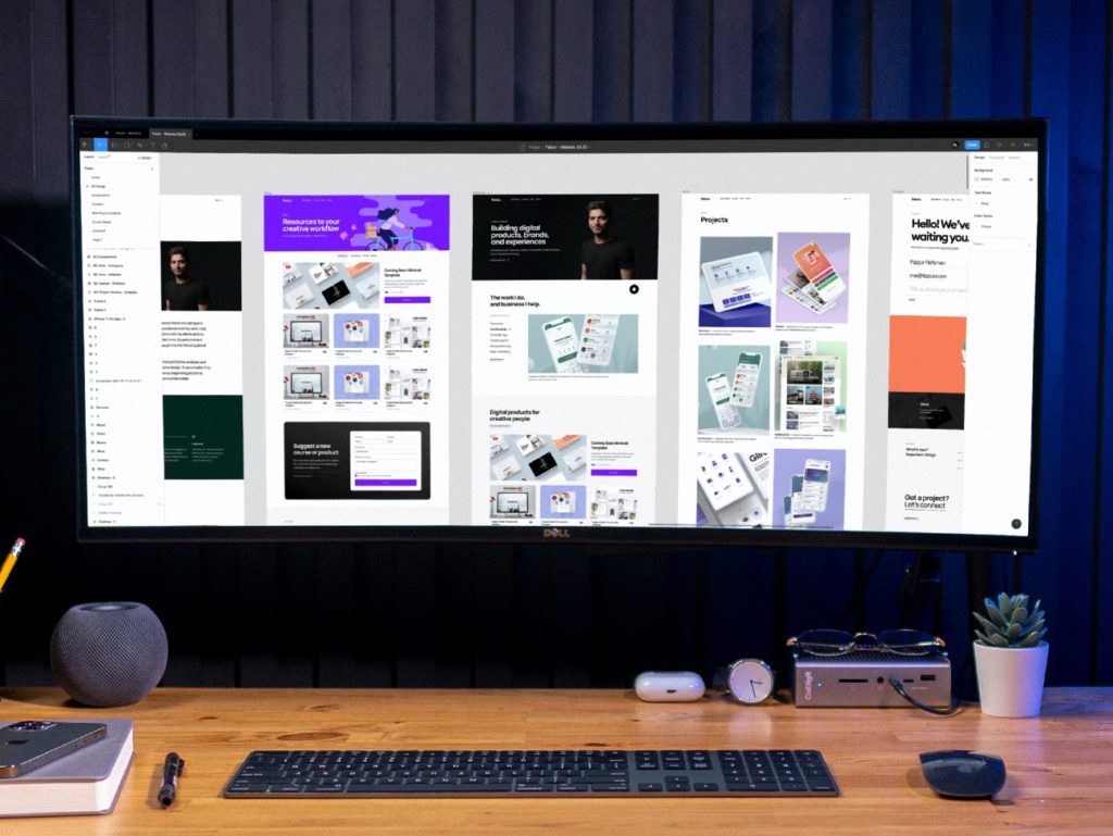
We don’t always start from scratch when we begin new work. Building a brand from the ground up is a great challenge and a lot of fun, but it’s far more common for us to utilize existing client assets. These can be in the form of a logo, printed pieces, or style guides. Our approach to design is dictated by what is (or isn’t) given to us.
The logo is the fundamental piece to any company’s identity. It is often the first thing we see on a website, sign, or handout. If you look closely, it can give insight into what that company is about and its personality. For us, it is the springboard for the direction in which we will work.
File formats of the logo can either open up possibilities or limit what it is that we can do with it. A scalable vector source file allows us to take individual layers to create design elements elsewhere on the project. A flat .jpg or .png is fixed and does not allow for that nor scaling any larger than it already is without distortion. In the best-case scenario, a logo package is included with a brand style guide.
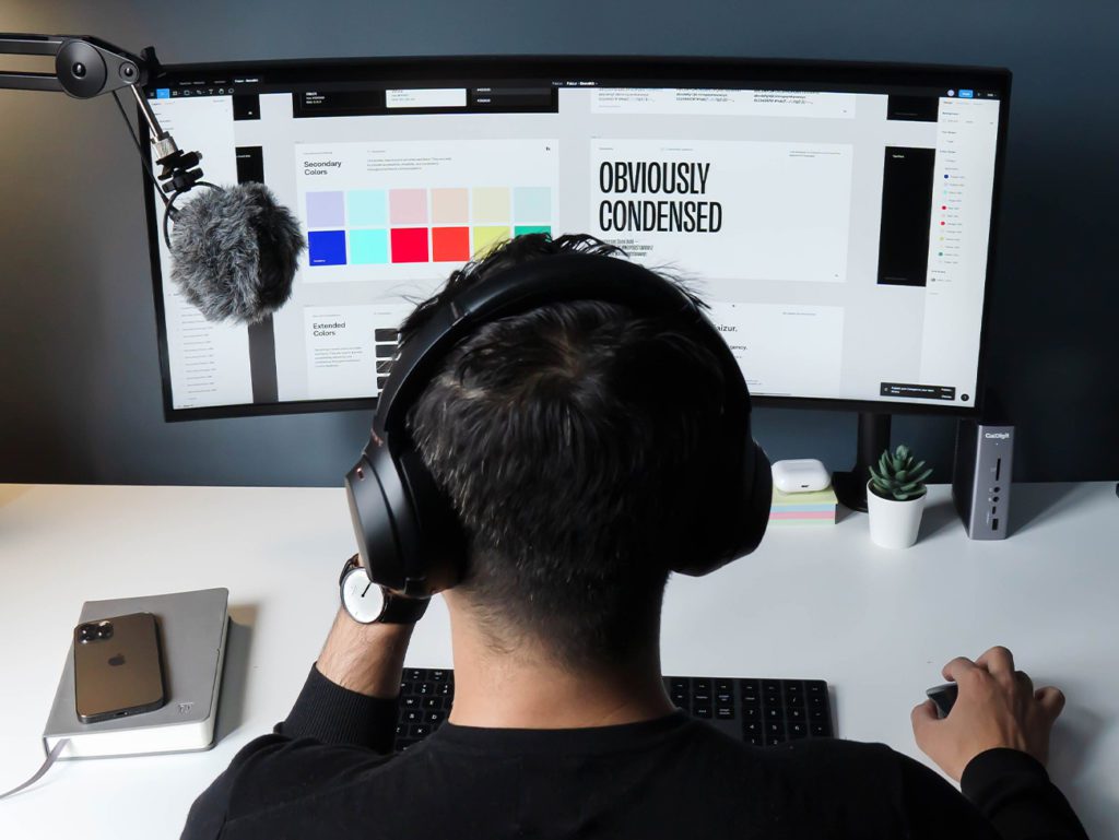
The style guide gives us the colors (HEX for web or CMYK for print) and fonts used (primary, secondary, and any alternatives). There is clear direction on what can and can’t be done with those assets, which ensures that we don’t violate any of the rules that have been set by their designers. Examples of this would be recoloring the logo, adding a color background, or not allowing enough space around the logo under their guidelines. Imagine a Coke logo with a green background; these cannot be ignored.
If documentation isn’t provided, then it’s up to us to examine the font to see if we can identify what it is and find it, either in our library or online. If it is not available, then we can either find a substitute or a complimentary font that pairs well with it. There has been the rare case where we’ve even been asked to recreate a company’s logo.
95% of our work is digital and on the web. There are times when we are asked to create print pieces, such as business cards, folders, or printable handouts. The process is mostly the same, with the biggest difference being working in CMYK instead of RGB. There are other things to pay attention to, like bleed and trim lines, but overall the layout and design principles remain consistent regardless of the medium. Stick to those and obey the brand guidelines and you’ll find working with another company’s assets is not any different than working with your own.
Have a project you’d like to discuss?
Fill out the form below and let’s have a conversation.